Butter yellow interior design trend is taking the design world by storm. This warm and inviting hue, a sophisticated twist on classic yellow, is surprisingly versatile, offering a captivating blend of comfort and style. From subtle accents to bold feature walls, this trend allows for a myriad of creative expressions, transforming spaces into cozy havens.
This exploration delves into the nuances of butter yellow, examining its historical context, psychological effects, and practical applications across various interior styles. We’ll also discover how to select the perfect shade, integrate it seamlessly into existing décor, and create a warm and welcoming atmosphere using this beautiful hue.
Defining the Trend
Butter yellow, a nuanced shade of yellow, is rapidly gaining traction in interior design. It offers a warm, inviting atmosphere, distinct from the boldness of canary yellow or the mutedness of ochre. This exploration delves into the specifics of butter yellow, its variations, its historical context, and the psychological impact it creates within a space.The “butter yellow” hue is a welcoming and versatile addition to any interior scheme, bridging the gap between sunny optimism and soft, comforting tones.
It’s not simply a color; it’s an emotional experience.
Shades and Tones of Butter Yellow
The butter yellow palette encompasses a range of warm, creamy tones. These shades vary in intensity and undertones, from a pale, almost cream-like yellow to a richer, more golden hue. Think of the variations in the color of butter itself – from the pale, almost white, to the deeper, more golden shades. This spectrum allows for customization and adaptability to different design styles.
Distinguishing Butter Yellow from Other Yellow Tones
Butter yellow stands apart from other yellow tones through its subtle, comforting qualities. Canary yellow, for example, is brighter and more vibrant, often associated with cheerfulness and energy. Mustard yellow is a more earthy, deep yellow, frequently used to evoke warmth and coziness, but it’s a bit more intense than butter yellow. Ochre, on the other hand, is a muted, sandy yellow, often used for a sense of tranquility and connection with nature.
Butter yellow occupies a middle ground, blending the best of these attributes into a more approachable and universally appealing tone.
Historical Context of Yellow in Interior Design
Yellow has a rich history in interior design, representing various moods and aesthetics throughout different eras. From the opulence of gilded rooms in the Baroque period to the optimistic use of sunny yellow in the Art Deco era, yellow has always held a powerful position. Butter yellow, with its soft and approachable nature, fits seamlessly into this history by providing a contemporary take on the warmth and vibrancy of yellow, without being overly assertive.
It speaks to a more modern aesthetic, while still drawing on the positive connotations of yellow from the past.
Psychological Effects of Butter Yellow in Interior Settings
Butter yellow, with its warm and inviting nature, often evokes feelings of happiness, positivity, and comfort. Its soft luminosity can create a sense of spaciousness and uplift the mood in a room. Studies have shown that warm colors like butter yellow can stimulate appetite and create a welcoming atmosphere, making it ideal for kitchens and dining areas. The shade’s subtle nature prevents it from being overwhelming or jarring, ensuring a pleasant and relaxing ambiance.
Its adaptability to various design styles, from minimalist to maximalist, makes it a versatile choice for diverse interiors.
Design Applications
Butter yellow, a soft and inviting shade, transcends the realm of mere color; it’s a powerful design tool capable of transforming spaces into havens of warmth and comfort. Its versatility allows for seamless integration into a wide array of interior styles, from modern minimalism to rustic charm. This exploration delves into the practical applications of butter yellow, showcasing its potential to create captivating and personalized living environments.The beauty of butter yellow lies in its ability to evoke a sense of serenity and optimism.
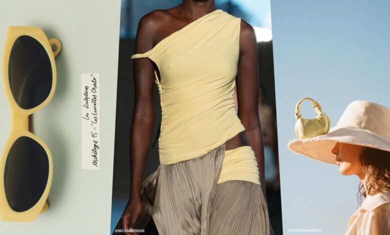
Butter yellow is having a moment in interior design, bringing a cheerful, almost sunny vibe to any space. It’s a bold choice, but it can really liven up a room. Speaking of bold choices, I’ve been reading up on Jamie Hood’s work, and her recent interview about the trauma plot in her latest project jamie hood trauma plot interview really resonated with me.
It’s interesting how the emotional depth in a story can mirror the vibrant impact of a butter yellow room. The trend definitely seems to be embracing a more emotional connection with interior aesthetics.
Its gentle hue, far from being a mere backdrop, can be a dynamic element, drawing the eye and adding depth to any design. This section will provide a comprehensive look at the design possibilities of butter yellow, from its use as a primary color to its role as a sophisticated accent.
Mood Board Examples
Butter yellow’s adaptability shines in diverse interior settings. The mood board below showcases its use in various spaces, illustrating the warmth and vibrancy it can bring to a living room, bedroom, and kitchen. Visualize a living room bathed in the soft glow of butter yellow, complemented by natural wood tones and warm lighting. In the bedroom, a subtle butter yellow accent wall can create a serene and calming atmosphere.
A kitchen adorned with butter yellow cabinets and warm-toned countertops creates a welcoming and inviting space. 
Accent Color Applications
Using butter yellow as an accent color allows for creative flexibility. A few strategically placed cushions, a statement rug, or a decorative vase can add a pop of warmth to a room. In a predominantly neutral space, butter yellow artwork or a single piece of furniture can create a focal point. In a more bold space, butter yellow can be used as an accent to balance out darker elements and create visual harmony.
Architectural Style Comparison
The table below illustrates how butter yellow adapts to different architectural styles.
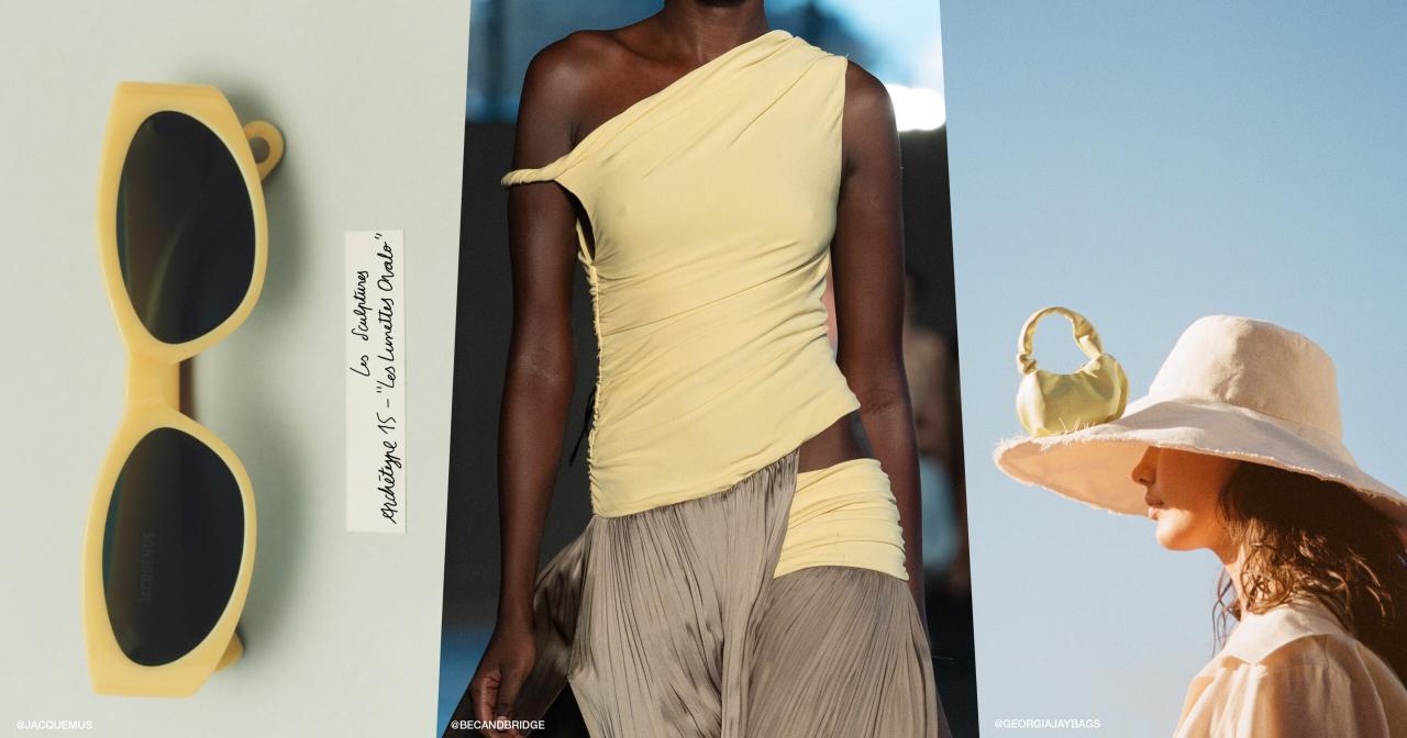
Butter yellow is having a moment in interior design, bringing a cheerful vibrancy to spaces. Think sunny rooms, and a touch of playful elegance. It’s a trend that’s not unlike the bold style often associated with celebrity couples like Rihanna and ASAP Rocky, whose relationship timeline, as seen here , shows a dynamic and stylish evolution.
Ultimately, butter yellow interiors exude a similar zest for life, making them a perfect choice for anyone seeking a space that feels both happy and sophisticated.
| Architectural Style | Application Examples |
|---|---|
| Modern | Used as an accent wall, or in a patterned rug. Minimalist furniture in the same shade can create a cohesive and sophisticated look. |
| Rustic | Paired with natural wood tones, leather, and warm textiles. Butter yellow can be used in kitchen cabinets or dining room accents to create a cozy and inviting atmosphere. |
| Traditional | Butter yellow can be used in draperies, upholstery, or wall paint, creating a sense of elegance and warmth. It works beautifully with antique furniture and classic designs. |
Intensity Levels
Different intensities of butter yellow can dramatically alter the atmosphere of a room.
| Intensity Level | Application Examples |
|---|---|
| Subtle | A pale butter yellow, almost cream-like, can be used as a base color or accent wall, adding a touch of warmth without overwhelming the space. |
| Moderate | A slightly more intense butter yellow can be used in furniture or accessories, creating a focal point or a sense of visual balance. |
| Bold | A rich butter yellow can be used as an accent wall or in a feature piece, creating a dramatic and warm statement in the room. |
Furniture, Textiles, and Accessories
Butter yellow is a versatile hue that complements various materials.
- Furniture: Butter yellow sofas, chairs, or even a single statement piece can add a touch of warmth and personality to any room. Pairing it with darker wood tones creates a sophisticated contrast.
- Textiles: Draperies, curtains, and cushions in butter yellow can create a cozy and inviting atmosphere. Patterned textiles featuring butter yellow as a key element add visual interest and depth.
- Accessories: Vases, artwork, and decorative items in butter yellow can add pops of color and personality to any space. The use of complementary materials such as wood or metal can further enhance the overall design.
Style Considerations
Butter yellow, a vibrant yet calming hue, demands careful consideration in interior design. Its versatility allows for a wide range of aesthetics, from cozy and inviting to sophisticated and modern. Understanding how to leverage design elements, lighting, textures, and color palettes alongside butter yellow is key to creating a truly successful space. The interplay of these elements dictates the overall mood and atmosphere of the room.The effective use of butter yellow relies on a nuanced approach.
Simply painting a wall butter yellow may not achieve the desired effect. Strategic application, combined with a keen eye for complementary elements, is vital. This involves understanding the nuances of lighting, textures, and color combinations to amplify the positive attributes of butter yellow.
Design Elements Enhancing the Butter Yellow Aesthetic
Butter yellow’s charm lies in its ability to evoke warmth and a sense of happiness. This vibrant shade works well with various design elements. Natural materials, such as wood, rattan, and linen, create a harmonious balance. Adding metallic accents, like brass or gold, provides a touch of elegance and sophistication. Incorporating botanical elements like lush greenery and fresh flowers can further enhance the room’s inviting ambiance.
Impact of Lighting on Butter Yellow
Lighting plays a crucial role in shaping the perception of butter yellow. Warm, ambient lighting, such as soft, incandescent bulbs or strategically placed table lamps, can create a cozy and inviting atmosphere. Natural light, when available, can further enhance the vibrancy and warmth of the butter yellow. Direct sunlight can, however, cause the color to appear brighter or even washed out, so careful consideration of the position of the furniture and the time of day is crucial.
Impact of Textures and Materials
Different textures and materials can greatly impact the overall feel of a space when paired with butter yellow. Smooth, polished surfaces, like marble or glazed ceramics, create a sophisticated and elegant look. Rougher textures, such as linen or jute, add a touch of rustic charm and warmth. The interplay of textures adds depth and dimension to the space.
For example, a butter yellow velvet sofa paired with a jute rug and a brass side table creates a rich and inviting atmosphere.
Butter yellow is having a moment in interior design, bringing a sunny, cheerful vibe to any room. It’s a beautiful, almost uplifting colour, perfect for a spring refresh. Want to complement this sunny interior aesthetic with a subtle beauty look? Try ditching the lip liner and embracing the “no liner lip liner” trend for a natural, effortless look.
no liner lip liner This fresh approach to makeup perfectly mirrors the airy, unfussy feeling of a butter yellow space. Ultimately, butter yellow interiors are all about easy elegance and a joyful atmosphere.
Balancing Butter Yellow with Other Colors and Design Elements
Butter yellow can be beautifully balanced with a range of colors. Neutral tones, such as beige, cream, and gray, create a calming and sophisticated backdrop for the butter yellow. Earthy tones, like terracotta and olive green, add depth and complexity. Adding pops of contrasting colors, like deep blues or rich greens, can create visual interest and draw attention to specific areas.
The key is to choose colors that complement the butter yellow without overpowering it.
Butter Yellow in Residential vs. Commercial Spaces
The application of butter yellow differs in residential and commercial settings. In residential spaces, butter yellow can be used liberally to create a warm and inviting atmosphere, enhancing the feeling of coziness and comfort. Soft lighting and warm textures are typically preferred to maintain the inviting ambiance. In commercial spaces, butter yellow can be used strategically to evoke feelings of happiness and positivity, such as in a retail store or office.
A subtle application in the form of accent walls or furniture can provide the desired effect. In commercial contexts, the application is often more subdued to maintain a professional atmosphere.
Creating a “Butter Yellow” Ambiance
Butter yellow, a soft and inviting hue, offers a versatile canvas for creating a warm and welcoming atmosphere. This shade, often described as a gentle sunshine, can transform any space into a cozy haven. Understanding how to select the perfect shade, integrate it seamlessly, and introduce it without overwhelming the room is key to achieving a truly delightful “butter yellow” ambiance.Selecting the ideal shade of butter yellow is crucial for a harmonious space.
A nuanced approach is essential, considering the overall lighting, existing color palette, and the desired mood.
Selecting the Perfect Butter Yellow Shade
Choosing the right butter yellow involves more than just eyeballing a paint chip. Factors such as the direction of natural light, the existing color scheme of the room, and the desired overall feeling are crucial. A deep understanding of how light interacts with color is essential. For instance, a yellow that looks vibrant in a north-facing room might appear washed out in a south-facing room.
Consider the color temperature of your existing lighting. A warm yellow will harmonize with warm lighting, while a cooler yellow might complement cooler tones.
Creating a Cohesive and Inviting Space
A cohesive butter yellow space doesn’t require an overwhelming amount of the color. The key is thoughtful placement and a harmonious integration with the existing décor. Use butter yellow as an accent color, or as a backdrop for other elements. Employing complementary colors such as creams, whites, and soft greens can enhance the warm, inviting nature of the yellow.
Integrating Butter Yellow into Existing Décor
Start by introducing small touches of butter yellow. Paint a single accent wall, use throw pillows or a rug in a butter yellow shade, or add a vase of butter yellow flowers. Gradually add more elements as you become more comfortable with the effect. If the existing décor leans towards cooler tones, introduce butter yellow gradually to avoid a jarring effect.
Introducing Butter Yellow Without Overwhelming
A subtle approach is often the most effective. Use butter yellow as an accent color, such as with decorative accessories, rather than as the primary color of the room. This helps create visual interest without overwhelming the space. Start with smaller items and gradually add more prominent butter yellow elements as needed. A well-placed butter yellow area rug or a few strategically placed throw pillows can significantly elevate the mood of the room.
Designing a Sample Room Layout
Imagine a living room with a butter yellow accent wall. The wall is painted a soft, creamy butter yellow. Neutral-toned furniture, such as a light gray sofa and matching armchairs, provides a balanced backdrop. A large, cream-colored area rug anchors the seating arrangement. Throw pillows and blankets in various shades of butter yellow and cream create a cohesive look.
A large, framed botanical print in muted tones enhances the space’s natural ambiance. Accessories such as a small, butter yellow side table and a few lamps in a warm gold finish complete the design. The lighting in the room should be warm and inviting, using a combination of ambient and task lighting to highlight the butter yellow elements.
This example demonstrates how butter yellow can be integrated into an existing design without overwhelming the room, while maintaining a welcoming and cozy ambiance.
Visual Inspiration: Butter Yellow Interior Design Trend
Butter yellow, a warm and inviting hue, can transform any interior space. Its versatility extends beyond a simple color choice; it becomes a canvas for diverse design styles and a powerful tool for creating a specific ambiance. Understanding how butter yellow interacts with different settings, materials, and architectural elements is crucial to maximizing its impact.
Butter Yellow in Various Interior Settings
Butter yellow, with its soft and comforting tone, can be seamlessly integrated into a wide range of interior styles. To showcase this versatility, consider the following examples.
| Style | Color Combinations | Ambiance | Image Description |
|---|---|---|---|
| Coastal Cottage | Butter yellow paired with soft blues, creams, and natural wood tones. | Relaxed, breezy, and inviting. | A light and airy living room featuring butter yellow walls, accented with light blue throw pillows and a cream-colored sofa. Natural wood accents and a large window offer a connection to the outdoors. |
| Modern Farmhouse | Butter yellow combined with gray, white, and black accents. | Warm and sophisticated. | A kitchen with butter yellow cabinets and countertops, contrasted with gray backsplash tiles and black hardware. A warm wooden island adds a touch of rustic charm. |
| Bohemian Chic | Butter yellow combined with earthy tones, jewel tones, and patterned textiles. | Eclectic, playful, and inviting. | A living room with butter yellow accent walls, combined with patterned rugs, colorful throw pillows, and macrame wall hangings. A mix of textures and patterns creates a unique atmosphere. |
| Scandinavian Minimalism | Butter yellow used as a subtle accent color, paired with white, gray, and natural wood. | Clean, serene, and sophisticated. | A bedroom with butter yellow bedside tables, contrasted with white walls and a gray bed. Natural wood floors and a minimalist aesthetic contribute to the overall feeling of tranquility. |
High-Resolution Images of Butter Yellow as a Focal Point
These images demonstrate the versatility of butter yellow as a focal point in various interior spaces.
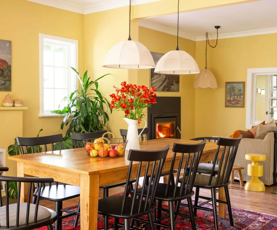
Image 1: A dining room with butter yellow walls. The walls are accented with subtle geometric patterns in cream and beige. The furniture is a light gray, allowing the butter yellow to stand out. Natural wood accents and a chandelier create a sophisticated and warm ambiance. A large window allows natural light to flood the room.
Image 2: A living room with butter yellow sectional sofa. The sofa is the focal point, complemented by a neutral rug and a gallery wall with framed artwork. Warm lighting fixtures and natural wood coffee table add to the cozy and inviting feel.
Image 3: A bedroom with butter yellow headboard. The headboard is the primary focal point, paired with a white bed frame and bedding. A soft blue accent wall adds depth and visual interest. Natural light and a large window offer a calming atmosphere.
Image 4: A kitchen with butter yellow cabinets. The cabinets are complemented by a white backsplash and stainless steel appliances. A warm wooden island adds a touch of rustic charm, and pendant lights create a warm, inviting glow. The space is bright and functional.
Image 5: A bathroom with butter yellow tiles. The tiles are complemented by a white sink and vanity. A glass shower enclosure and natural wood accents add a modern touch to the space.
Butter Yellow in Architectural Styles
Butter yellow can be integrated into various architectural styles.
Image 1: A traditional craftsman-style home with butter yellow siding. The siding complements the natural wood accents of the home’s exterior, creating a warm and inviting aesthetic. The yellow provides a welcoming feel, enhanced by the architectural details of the home.
Image 2: A modern contemporary home with butter yellow accents in the interior. The use of large windows and open floor plans highlights the yellow, enhancing the clean lines and geometric forms of the architecture.
Image 3: A mid-century modern home with butter yellow furniture and accents. The warm yellow contrasts with the cool tones of the home’s architecture, creating a harmonious and inviting space. The furniture pieces, with their organic shapes, complement the architectural style beautifully.
Butter Yellow in Minimalist and Maximalist Designs
Butter yellow can be used in both minimalist and maximalist designs.
Minimalist: In a minimalist setting, butter yellow can be used as a subtle accent, such as a single piece of furniture or a decorative throw pillow. The color’s warmth complements the clean lines and simplicity of the space without overwhelming it. This is a great approach for creating a calm and serene atmosphere.
Maximalist: In a maximalist setting, butter yellow can be a dominant color, used in various textiles, furniture, and accessories. This approach creates a bold and energetic atmosphere. The key is to carefully consider the overall color palette to ensure the space doesn’t feel cluttered or chaotic. The yellow should enhance the other elements, rather than overpowering them.
Gallery Wall with Butter Yellow
A gallery wall featuring butter yellow artwork can create a captivating focal point. Pairing butter yellow with complementary colors, such as gray, navy, or deep teal, can create visual interest and impact. The warm tone of butter yellow can be balanced by cool-toned artwork frames. The resulting gallery wall should be cohesive and well-balanced, not chaotic or overwhelming.
Practical Applications
Butter yellow, with its cheerful and inviting nature, offers a multitude of practical applications in interior design. Its versatility extends beyond a simple aesthetic choice, enabling designers to tailor the space to specific needs and moods. From creating a playful haven for children to fostering a tranquil sanctuary in a bedroom, butter yellow can transform any room.Understanding how to integrate butter yellow effectively is key to achieving the desired atmosphere.
Strategic use of this hue, coupled with careful consideration of lighting and room size, can unlock its full potential. This section delves into practical ways to incorporate butter yellow into various rooms, ensuring a harmonious and personalized environment.
Incorporating Butter Yellow in Different Spaces
Butter yellow’s adaptability allows for its use across diverse rooms. Its warm and inviting quality can be a perfect addition to a living room, fostering a sense of sociability.
Kid’s Room
Creating a playful and stimulating atmosphere for children is easier with butter yellow. A butter yellow accent wall, combined with pops of complementary colours like turquoise or coral, can create a dynamic and engaging space. Furniture in a lighter wood tone complements the yellow, enhancing the cheerful vibe.
Bedroom
In a bedroom, butter yellow can promote a sense of calm and tranquility. A soft butter yellow paint colour on the walls, combined with a neutral bedding set and warm lighting, creates a serene and inviting space. This can help to promote relaxation and better sleep.
Living Room
A living room bathed in butter yellow can instantly uplift the mood. A butter yellow sofa or armchair, contrasted with warm-toned wood furniture, creates a focal point and encourages relaxation and conversation. This approach also allows for the addition of vibrant accent colours to create a more lively feel.
Dining Room, Butter yellow interior design trend
The dining room, a space for gathering and conversation, can benefit from the warm and inviting nature of butter yellow. Butter yellow can be incorporated with a table runner or chairs, creating a pleasant atmosphere for meals. This approach can promote a feeling of togetherness.
Bathroom
A touch of butter yellow in a bathroom can be a surprising yet effective way to create a more welcoming and inviting atmosphere. This can be achieved with yellow-toned accessories like towels or a patterned shower curtain.
Small Spaces
Incorporating butter yellow in a small space requires a delicate touch. Using butter yellow as an accent colour, rather than a dominant one, helps to avoid overwhelming the room. This can be achieved by using yellow for decorative pillows, throw blankets, or artwork.
Lighting Scenarios
Butter yellow interacts beautifully with different lighting scenarios. Natural light enhances the warmth and vibrancy of butter yellow, creating a cheerful and inviting atmosphere. Artificial lighting, such as warm-toned lamps, amplifies the inviting quality of butter yellow, casting a soft and comforting glow.
Creating a Warm and Welcoming Atmosphere
The key to creating a warm and welcoming atmosphere with butter yellow lies in the subtle integration of the colour. Using butter yellow in combination with warm-toned woods, textures, and accessories helps to amplify the inviting feeling. This creates a sense of comfort and relaxation, making the space feel like a home.
Concluding Remarks
In conclusion, the butter yellow interior design trend is more than just a color; it’s a statement. This versatile hue allows for both subtle sophistication and bold creativity. By understanding its nuances, you can effortlessly incorporate butter yellow into your space, creating a truly unique and inviting environment.