
Yves Béhar and Moooi Redefine the Domestic Landscape with Peaks Modular Seating System at Milan Design Week
The intersection of geography, philosophy, and industrial design has found a new expression in Milan, Italy’s primary commercial and cultural hub. Nestled at the base of the Alps, Milan has long served as a gateway to the soaring mountain range that has captivated the European consciousness for millennia. Historically, the Roman Empire viewed these snow-capped peaks as a formidable barrier to be conquered. Culturally, they have served as a profound muse: for the Austrian composer Gustav Mahler, the dramatic topography of peaks and valleys mirrored the emotional oscillations of creative work; for the German philosopher Friedrich Nietzsche, the Alpine heights were a sanctuary for intellectual clarity and the pursuit of wisdom. This rich historical and geological context now serves as the foundation for "Peaks," a modular seating system designed by Swiss-born, San Francisco and Lisbon-based designer Yves Béhar for the Dutch design house Moooi.
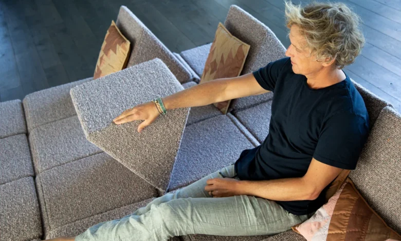
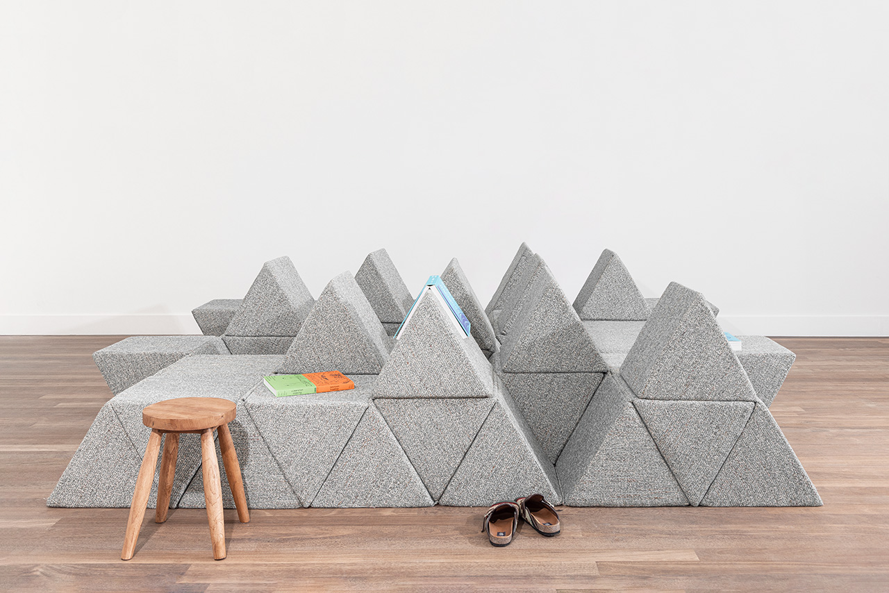
Launched during the 25th-anniversary showcase of Moooi at Milan Design Week, held from April 20 to 26, the Peaks system represents a fundamental reimagining of the "living landscape." The collection draws inspiration from the childhood memories of Béhar, the founder of the award-winning design firm Fuseproject, while paying homage to the radical furniture experiments of the late 20th century. By distilling the complex geometry of the Alps into a series of interchangeable, extruded equilateral triangles, Béhar has created a furniture typology that prioritizes adaptability, social interaction, and ergonomic versatility.
The Evolution of the Living Landscape
The concept of a "living landscape" is not entirely new to the world of high design, but its revival in the 21st century marks a significant shift in how domestic spaces are utilized. In the 1960s and 70s, visionary designers such as Verner Panton and Pierre Paulin challenged the traditional, static nature of furniture. They introduced fluid, non-hierarchical seating arrangements that encouraged users to lounge, crawl, and interact in ways that conventional sofas and chairs did not allow.
Yves Béhar’s Peaks system builds upon this legacy but integrates modern materials and a more rigorous geometric logic. The system is composed of a "kit of parts" consisting of triangular modules that can be arranged in nearly infinite configurations. The sloped surfaces of these triangles are engineered to support the human body in various reclining positions, yet when the modules are aligned, they form a continuous, solid plane suitable for sleeping or communal gathering. This duality allows the furniture to transition seamlessly from a collection of individual lounge spots to a unified "conversation pit," a typology that has seen a resurgence in popularity as homeowners seek to counteract the isolation of the digital age.
Technical Engineering and Material Innovation
To achieve the balance between comfort and structural integrity, the Peaks system utilizes advanced manufacturing techniques and materials. Each component is produced using dual-density foam. This approach involves layering foams of varying firmness: a high-density core provides the necessary support to maintain the crisp, geometric silhouette of the "peaks," while a softer outer layer ensures the tactile comfort required for extended use.

The modularity of the system is facilitated by a sophisticated internal architecture. Concealed zippers and fabric hinges allow the individual units to be connected or detached with ease. This design choice ensures that the system remains organized and stable during use, yet remains simple enough for a single person to reconfigure without professional assistance. The result is a piece of furniture that functions less like a heavy, permanent fixture and more like a dynamic tool for living.
A Personal Experiment in Play and Proximity
For Yves Béhar, the development of Peaks was driven by a perceived deficiency in contemporary living room design. He observed that most modern furniture dictates specific, often formal, modes of interaction that lack the flexibility required by modern families. Speaking on the impetus behind the project, Béhar noted that living room furniture often forces users into rigid patterns and misses the opportunity for "adaptability and wonder."
"Peaks was a personal experiment in my home to find a central piece of furniture that immediately induces a sense of ‘play’ for adults and kids combined," Béhar stated. The designer integrated the prototype into his own household before bringing it to market, observing how the non-traditional shapes encouraged his family to interact more spontaneously. "Soon after Peaks was installed, laughter and closeness made my living room the center of the house again and again," he remarked, highlighting the design’s ability to facilitate social bonding through physical configuration.

Moooi at 25: A Quarter Century of "Unexpected Welcome"
The debut of Peaks coincides with a major milestone for Moooi. Founded in 2001 by Marcel Wanders and Casper Vissers, the brand has spent 25 years establishing itself as a leader in the "extraordinary" design space. Known for a philosophy they describe as an "unexpected welcome," Moooi has consistently bridged the gap between functional industrial design and the more whimsical, decorative arts.
The anniversary showcase in Milan served as a retrospective of the brand’s influence while looking toward the future of the domestic interior. By partnering with Béhar—a designer known for his work in sustainable technology and human-centric industrial design—Moooi signaled a commitment to furniture that is as intellectually rigorous as it is visually striking. The Peaks system fits perfectly within Moooi’s catalog, offering a product that is both a sculptural statement and a highly functional solution for the modern home.
The Resurgence of the Conversation Pit
The popularity of the Peaks system at Milan Design Week can be attributed in part to a broader trend in interior design: the return of the conversation pit. Originally popular in the mid-20th century, conversation pits were recessed seating areas that prioritized face-to-face interaction. In recent years, as "virtual burnout" has become a documented social phenomenon, there has been a renewed interest in furniture that promotes physical and social engagement.

Unlike the built-in conversation pits of the 1970s, which required architectural intervention and were difficult to remove, the Peaks system offers a "plug-and-play" version of this typology. It allows residents of modern apartments and homes to create a communal hub that can be expanded, contracted, or moved entirely depending on the occasion. This adaptability is particularly relevant in urban environments where multi-functional spaces are a necessity.
Chronology of Development and Launch
The journey of the Peaks system from concept to the Milan debut followed a meticulous development timeline:
- Conceptualization (2023-2024): Béhar began exploring the geometry of the equilateral triangle as a basis for modular seating, drawing on his Alpine heritage and the work of mid-century modernists.
- Prototyping and Home Testing (2024-2025): The designer developed initial prototypes using dual-density foam and tested them in his own home to refine the ergonomics and ease of reconfiguration.
- Collaboration with Moooi (Mid-2025): Moooi recognized the design’s alignment with their 25th-anniversary vision, and the two parties collaborated to finalize the textile options and manufacturing processes.
- Official Launch (April 20, 2026): The system was unveiled to the public at the Moooi exhibition during Milan Design Week, receiving immediate attention for its unique silhouette and social utility.
Broader Implications for Sustainable and Adaptive Design
The introduction of Peaks also touches upon the growing industry focus on longevity through adaptability. Traditional sofas are often discarded when a user moves to a new space or when their family needs change, primarily because fixed-frame furniture cannot easily adapt to new floor plans. By contrast, a modular "kit of parts" like Peaks can be scaled up or down. A user might start with three modules in a small apartment and add four more when moving to a larger home, thereby extending the lifecycle of the product and reducing waste.

Furthermore, the focus on "play" in furniture design represents a shift in the psychology of the home. As the boundaries between work and life continue to blur, there is an increasing demand for domestic environments that provide sensory relief and encourage movement. Peaks addresses this by inviting users to climb, stack, and rearrange their environment, transforming the living room from a place of passive consumption (such as watching television) into a space of active participation.
Market Reception and Future Outlook
Industry analysts at Milan Design Week have noted that the Peaks system is indicative of a "soft contract" trend, where the lines between residential furniture and commercial/office lounge furniture are disappearing. As modern offices strive to become more "homelike" and homes become more multi-functional, modular systems that can accommodate both solitary work and group collaboration are becoming highly sought after.
The Peaks system is now available through Moooi’s global distribution network. As the brand moves into its next quarter-century, the collaboration with Yves Béhar stands as a testament to the enduring power of nature-inspired design and the essential human need for flexible, communal spaces. By bringing the "living landscape" of the Alps into the interior, Béhar and Moooi have provided a sophisticated solution for the complexities of 21st-century living.

