The 2027 Colors of the Year Unveil a Collective Shift Toward Earthy Greens, Muted Blues, and Grounded Neutrals

Each autumn, the global design community turns its collective gaze toward the future, anticipating the chromatic shifts that will define architecture, interior design, fashion, and product manufacturing over the coming year. Leading paint and color manufacturers issue their annual Color of the Year selections not merely as marketing exercises, but as synthesized forecasts rooted in sociological observations, evolving cultural paradigms, and psychological responses to the built environment. As the predictions for 2027 roll out across the industry, a clear and unified narrative has emerged: the design world is pivoting decisively away from hyper-minimalist sterility and stark brights in favor of nature-inspired hues that promote emotional restoration, tactile comfort, and deep personal reflection.
The 2027 palette is heavily dominated by soothing greens, rich earthy browns, and muted, atmospheric blues. Rather than acting as fleeting novelties, these choices function as foundational elements designed to anchor spaces in an era marked by rapid technological acceleration and socio-environmental consciousness. This comprehensive overview examines the shades defining the upcoming year, the socio-cultural methodologies driving each manufacturer’s choice, and the broader macroeconomic and design implications of a world turning inward toward organic sanctuaries.
The Evolution of the Color of the Year Phenomenon
To understand the weight of the 2027 forecasts, one must look at the historical trajectory of the Color of the Year tradition. Pioneered decades ago by industrial color institutions and major chemical corporations, the practice has transformed from a niche trade prediction into a major cultural touchstone. Over time, these selections have evolved into influential macroeconomic trendsetters, dictating supply chain priorities for textile mills, ceramic tile manufacturers, consumer electronics brands, and fast-moving consumer goods.

Historically, color forecasting relies on a multi-year lead time. Color anthropologists, psychologists, and trend forecasters analyze global consumer sentiment, economic indicators, architectural movements, and pop culture to predict where the public psyche will head next. In the wake of global shifts toward remote work, hybrid living, and heightened awareness of mental health, residential and commercial interiors have been re-evaluated as protective envelopes. The 2027 palette directly mirrors this evolution, building upon previous years’ experiments with biophilic design and pushing them toward a more permanent integration of nature and architecture.
Nature-Infused Greens: Anchoring the Modern Sanctuary
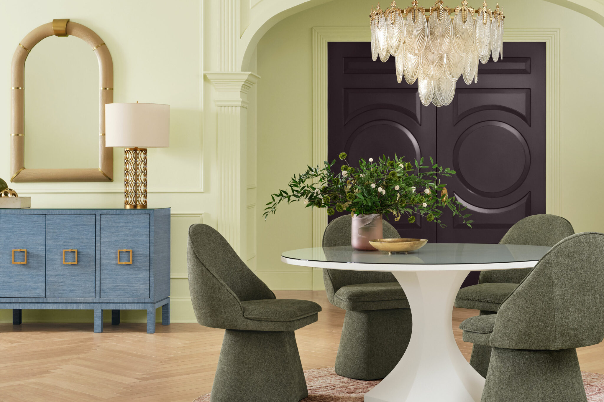
Green remains a powerhouse in the 2027 forecasts, though the interpretations span a wide spectrum from mossy depths to airy pastels. This versatility highlights green’s unique psychological position as a color that bridges vitality and restfulness.

Behr’s selection for 2027, Grounded, sets a heavy, stabilizing tone. Merging mossy olive hues with deep brown undertones, Grounded is engineered to blur the boundary between indoor living areas and the untamed natural world. According to design analysts at Behr, the shade acts as a structural anchor for open-concept spaces, transforming contemporary living rooms into natural sanctuaries that counteract digital fatigue.
Similarly, Benjamin Moore looks to timeless traditions with Webster Green. Bypassing momentary trends, Webster Green carries the sophisticated weight of classic architecture. It balances historical design cues with contemporary adaptability, offering a moody, character-rich backdrop that feels equally at home in a library nook or a modernized urban loft.
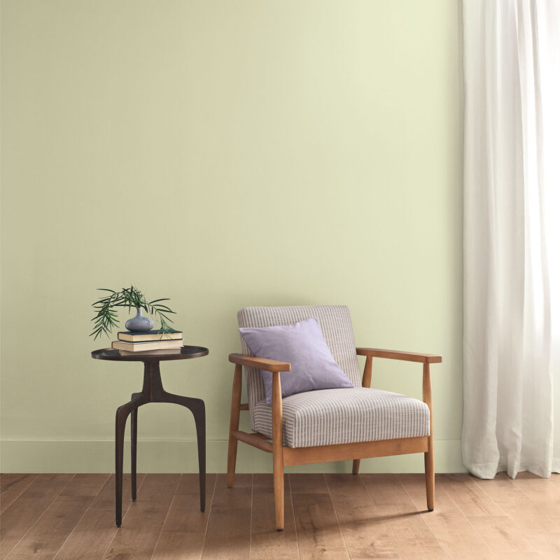
Sherwin-Williams approaches the botanical spectrum from a lighter, more restorative angle with Celery. This airy, pastel green combines tranquility with subtle vitality. By emphasizing the intrinsic relationship between interior aesthetics and human well-being, Celery functions as a flexible bridge between organic neutrals and more vibrant, contemporary colorways, offering a breath of fresh air in compact urban apartments.
The Rise of Moody and Muted Blues: Cultivating Calm and Introspection
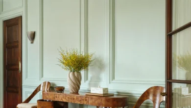
Blue has long been utilized in interior architecture for its calming physiological effects—known to lower heart rates and promote focus. For 2027, paint manufacturers have leaned into muted, deep, and water-inspired variants that offer emotional refuge.

Valspar introduces Cottage Door, a muted blue that draws heavily on the raw, unpolished beauty of natural materials. Designed to support the growing cultural movement toward intentional, slow living, Cottage Door is free from seasonal constraints. Its understated character embraces the beauty of imperfection, celebrating the patina of lived-in spaces.
Glidden presents Artifact, a calm and muted aqua hue designed to refresh the domestic landscape without requiring disruptive renovations. Artifact serves as a sophisticated evolution of the ubiquitous minimalist white trend, retaining the luminous simplicity of white while washing the walls in a delicate, grounding trace of color.

California Paints contributes Quiet Peace, a deep and moody blue that actively encourages occupants to slow down. Rather than serving as a passive backdrop, Quiet Peace creates a thoughtful dialogue between the architecture of a room and the psychological state of its inhabitants, acting as an antidote to external environmental chaos.
Rounding out the blue spectrum, Ace Hardware’s paint brand Clark+Kensington selected Vantage Point, a radiant blue that infuses everyday living areas with a crisp, optimistic perspective and an uplifting surge of creative energy.

Earthy Browns and Terracottas: Warmth, History, and Tactile Luxury
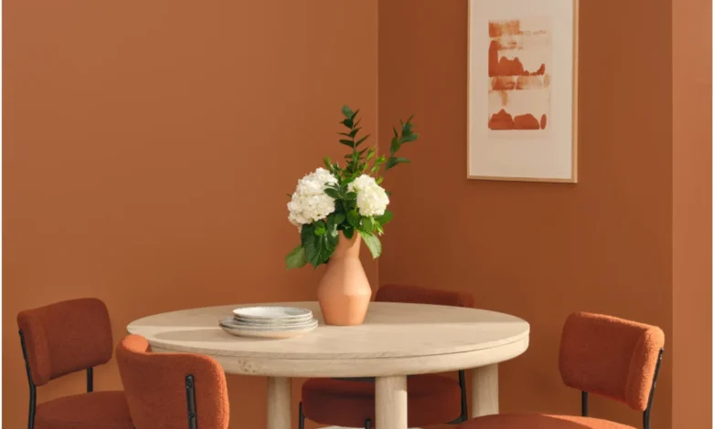
Perhaps the most palpable shift in the 2027 forecasts is the resurgence of rich, atmospheric browns, warm terracottas, and dusky pink-mauves. These shades signal a departure from cool grays and stark whites, introducing a tactile warmth that appeals to tactile and sensory-driven design strategies.
Little Greene selected Marle as its 2027 flagship color. Mirroring parallel movements in high fashion and interior architecture, Marle is a sumptuous yet relaxed brown engineered to foster deep physical comfort. Little Greene’s Creative Director, Ruth Mottershead, emphasizes the hue’s unique duality, noting its ability to balance visual richness with restraint.

Dunn-Edwards mirrors this sentiment with French Press Coffee. This silky, deeply saturated brown evokes historical luxury and domestic intimacy, relying on its atmospheric weight to wrap rooms in sophisticated warmth.
Dutch Boy Paints introduces Deep Rooted, an earthy terracotta hue with robust warm undertones. True to its name, Deep Rooted aims to cultivate dependable, authentic environments that encourage personalized, highly individualized home styling.

In the realm of historical crossover, Graham & Brown introduces Rose Earth, inspired by Italian clay deposits and classical painting pigments. By translating ancient artistic mediums into modern walls, Rose Earth bridges centuries-old architectural history with contemporary residential design.
Finally, C2 rounds out the earthy spectrum with Pueblo. Exploring what it means to feel truly alive within a built environment, Pueblo combines earthy pink and mauve tones to encourage physical interaction with interior architecture, shifting the paradigm from merely retreating from the world to actively engaging with one’s immediate surroundings.

Economic, Environmental, and Industry Implications
The convergence of these specific palettes across competing manufacturers points to profound macroeconomic and psychological undercurrents. Industry analysts note that when independent paint brands simultaneously land on earth tones, greens, and muted blues, it reflects a shared consumer desire for security, permanence, and sustainability amidst global uncertainty.
From a manufacturing standpoint, the pivot toward natural pigments and complex undertones requires advancements in colorants and base formulations to ensure color stability across varying lighting conditions. Furthermore, the emphasis on timelessness—shades explicitly marketed as "seasonless" or "beyond trends"—reflects a growing consumer pushback against fast-cycle home renovation culture. Homeowners are increasingly investing in durable, high-quality finishes designed to last decades rather than years, aligning interior design choices with broader circular economy and sustainability goals.

As these 2027 Colors of the Year transition from marketing campaigns to physical spaces, they will inevitably dictate the trajectories of adjacent design sectors. Furniture designers, textile mills, tile manufacturers, and decor brands are already aligning their upcoming product lines to complement these botanical greens, atmospheric blues, and restorative earthy browns. Ultimately, the 2027 color forecast serves as a collective architectural blueprint for the home: not as a stage set for transient trends, but as a deeply personal, restorative sanctuary designed to weather the complexities of the modern world.