Decoding the American Interior: Samplize Report Reveals Massive Shift Toward Warm Paint Hues

For decades, the trajectory of residential interior design has been charted primarily by retrospective sales figures, brand declarations of annual color trends, and the intuitive predictions of high-profile forecasters. These traditional barometers have long dictated what consumers supposedly want on their walls, often highlighting a particular hue months before it appears in hardware stores or professional portfolios. However, a groundbreaking data set is changing how the industry understands color adoption by examining the crucial, highly volatile phase that happens before a single brush touches a wall: the sampling stage.
The inaugural Samplize American Paint Color Report provides an unprecedented look into consumer psychology and experimentation by analyzing millions of paint samples ordered across the United States. Spanning a three-year comparative window during the first six months of 2024, 2025, and 2026, the report tracks consumer behavior across three of the industry’s most influential and widely specified brands: Benjamin Moore, Farrow & Ball, and Sherwin-Williams. By tracking what homeowners actually test side-by-side during the decision-making process, the report cuts through the noise of marketing campaigns to reveal the genuine, unvarnished design inclinations of the American public.
The Anatomy of the Paint Decision-Making Process
Understanding the mechanics behind the Samplize report requires examining how modern consumers approach the daunting task of choosing interior paint. Historically, interior design experts could only guess at the shortlists consumers compiled. They knew what sold in high volumes at retail counters, but the discarded alternatives—the shades tested, debated, and ultimately rejected—remained largely invisible.
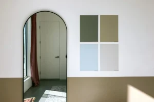
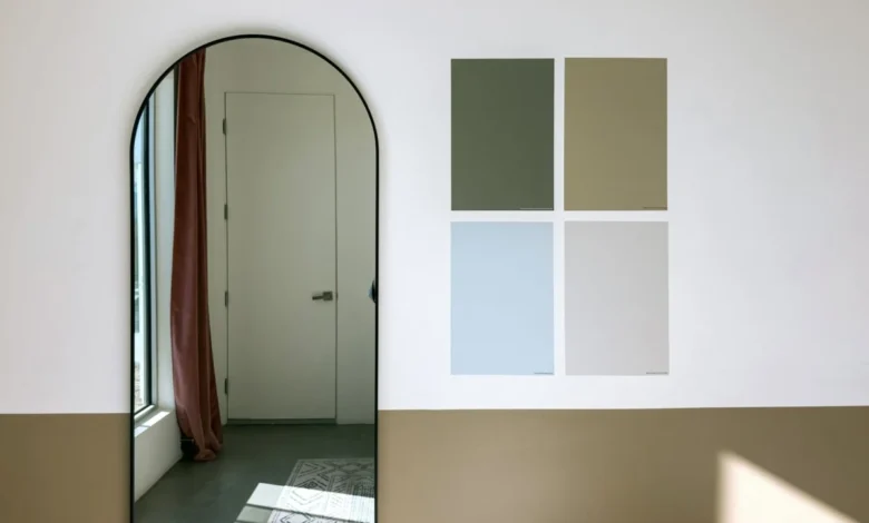
Makenna Lutz, partnerships lead at Samplize, emphasizes that analyzing the peel-and-stick sampling phase unlocks critical missing data for the design industry. According to Lutz, tracking this preliminary stage illuminates three fundamental elements of consumer behavior: the comprehensive shortlist a person actually weighed, the specific colors tested in direct competition against one another, and the degree to which those shortlists span multiple competing paint manufacturers.
Rather than remaining loyal to a single brand’s curated palette, contemporary homeowners are increasingly conducting cross-brand comparisons. They place a Benjamin Moore neutral directly next to a Sherwin-Williams chromatic gray and a Farrow & Ball historical tone on their drywall, evaluating subtle undertones under shifting natural and artificial lighting conditions. This rigorous testing phase demonstrates that modern consumers are highly deliberate, making the massive influx of data collected by sample distributors a goldmine for trend analysts and interior architects alike.
A Decisive Swing Toward Warmth
The most prominent and statistically significant finding to emerge from the multi-year data is a wholesale abandonment of the clinical, cool-toned palettes that dominated residential design throughout the 2010s. Over the three-year observation period, warm colors experienced a meteoric rise, growing at a rate nearly three times faster than their cool-toned counterparts.
As of the latest tracking periods, warm hues account for an overwhelming 69.4% of all paint shades tested through the platform. This represents a substantial upward tick from 64.3% just two years prior. Furthermore, the polarization of consumer choices is becoming increasingly absolute: half of all American paint shortlists analyzed now contain zero cool colors. This is a noticeable increase from the beginning of the study in 2024, when only 43% of shortlists completely excluded cool tones.
For industry watchers, the immediate assumption might be that this trend simply signals a tired, predictable retreat back to the safe realms of pale beige and stark white creams. However, a deeper dive into the metrics reveals a far more sophisticated and nuanced shift in consumer tastes—one defined not by a watering down of color, but by a bold embrace of temperature across the entire tonal spectrum.
Dispelling the Myth of the Pale Neutral
One of the most unexpected revelations of the Samplize report challenges the long-held assumption that warmer interiors naturally equate to lighter, airier spaces. In previous decades, a shift away from cool grays typically heralded an era of ivory, ecru, and barely-there beige.
"The genuine surprise was in the split by depth," notes Lutz, pointing to the data breakdown that defied initial analyst expectations. "We expected the warming to show up as lightening—it didn’t. Warm outgrew cool at every depth, and the deepest warm tones grew fastest of all, roughly six times faster than deep cool tones."
This metric shatters the monolithic view of warm design. Homeowners are not merely swapping out stark grays for soft creams; they are actively experimenting with deep, saturated warmth. At the lighter end of the spectrum, consumers are heavily sampling blush-toned plasters and buttery, organic creams. Frequently requested references include Farrow & Ball’s historic Setting Plaster, Benjamin Moore’s nuanced Proposal, and Sherwin-Williams’ inviting Malted Milk.
Simultaneously, however, consumers are pairing or replacing these soft hues with exceptionally dark, dramatic warm tones. Benjamin Moore’s Classic Burgundy—arguably one of the most intense and dramatic shades included in the entire data set—grew at a pace directly comparable to its lighter contemporaries. This proves that the American appetite for moody, high-impact interiors has not waned; rather, the underlying temperature of that drama has shifted decisively away from the icy charcoals and navy blues of the past decade.
The Rise of Complex Neutrals and Muted Earth Tones
The evolution of color preference is perhaps nowhere more visible than in the explosive growth of the brown color family. Brown shades surged faster than any other designated category within the report, climbing from appearing in just 9.2% of consumer shortlists to a commanding 13.4%.
Yet, a closer examination of the specific shades driving this category reveals that traditional, highly saturated chocolate browns or bright terracottas are not taking over American walls. Instead, the vanguard of the brown family consists of complex, transitional neutrals. Shades such as Sherwin-Williams’ Warm Stone and Urbane Bronze, Farrow & Ball’s moody London Clay, and Benjamin Moore’s Smokey Taupe are leading the charge.
These colors occupy a sophisticated middle ground. They are categorized as greiges, warm grays, and stone-like tones that bridge the gap between historic earthiness and modern minimalism. By utilizing these complex hybrids, homeowners can introduce grounding warmth without committing to the heavy, sometimes oppressive visual weight of traditional wood-toned brown rooms.
Green Settles Into the Permanent Palette
While warm tones and sophisticated browns capture the fastest growth vectors, green has officially transitioned from a transient trend to a foundational pillar of the American interior design palette.
Following a sharp, unprecedented surge in popularity during the early post-pandemic design boom, green has successfully defended its territory. It now maintains a steady, prominent presence, appearing in 34.6% of all consumer shortlists analyzed. Crucially, the green family is remarkably diverse in consumer testing. Homeowners are not coalescing around a single shade of emerald or sage; rather, shortlists feature a wide spectrum ranging from pale, ethereal botanical greens to dark, forest-inspired tones that mimic the exterior landscape.
This sustained presence suggests that green is no longer viewed as an accent color or a bold design risk. Instead, it functions as a neutral, providing a biophilic connection to nature that complements the broader societal movement toward warm, organic residential environments.
Behavioral Insights: The Monolithic Shortlist
Beyond the specific pigments and hues, the Samplize report offers a fascinating window into the cognitive architecture of consumer decision-making. The data indicates that when it comes to color temperature, homeowners are remarkably decisive—or perhaps deeply hesitant to mix opposing palettes.
Two-thirds of all consumer shortlists analyzed contained colors belonging to exclusively one temperature group. Half of all shortlists were entirely warm, containing zero cool shades, while approximately one-third restricted their testing exclusively to cool tones. Only a small minority of consumers actively mixed warm and cool shades on the same sample sheet. This binary approach suggests that when individuals decide to pivot the emotional tenor of a room, they commit fully to that thermal direction rather than attempting delicate balancing acts with mixed undertones.
Furthermore, the data points to a subtle diversification within the warming trend. While neutrals continue to dominate baseline testing, smaller, more chromatic color families are experiencing rapid percentage growth from lower baselines. Pink and red, for instance, emerged as the fastest-growing color families in terms of velocity from smaller starting positions. Combined with the finding that warm-and-deep is the fastest-growing combination of temperature and depth, it is evident that consumers are willing to take calculated chromatic risks, provided those risks operate within a warm, cohesive framework.
Implications for the Future of Interior Design
While three years of sample data cannot definitively predict the exact visual landscape of American homes over the next decade, the implications of the Samplize American Paint Color Report are profound for manufacturers, interior designers, and real estate professionals alike.
The data confirms that the design ethos of the country is experiencing a profound psychological shift. The desire for clinical perfection, stark minimalism, and detached coolness has been steadily supplanted by an instinctual yearning for comfort, historical resonance, and tactile warmth. Whether manifested through a soft, powdery plaster pink, a complex stone-gray taupe, or a deeply enveloping burgundy, the modern consumer is seeking sanctuary.
Ultimately, paint remains the most cost-effective and transformative tool in residential design. By capturing the intimate, trial-and-error phase where homeowners grapple with identity, light, and space, reports of this nature move the design industry past the realm of speculative forecasting. They ground the conversation in empirical reality, proving that the future of interior design is not dictated from the top down by corporate declarations, but forged from the bottom up by millions of individual choices made one peel-and-stick sample at a time.