Decoding the American Paint Color Revolution: A Deep Dive Into Samplize’s New Data

Paint trends have historically been dictated from the top down. For decades, interior design houses, color forecasting agencies, and major paint manufacturers have taken center stage at the beginning of each year to announce their coveted Colors of the Year, unveiling meticulously curated palettes intended to define the aesthetic of the coming months. These declarations, while influential, capture a specific moment of intent—what tastemakers believe people should want or what consumers eventually purchase at the point of sale. However, a significant gap has always existed between the glossy marketing campaigns of paint manufacturers and the hesitant, experimental reality of how homeowners actually choose colors for their living spaces.
A new paradigm in color research is now bridging that gap. The inaugural Samplize American Paint Color Report offers an unprecedented look at consumer behavior by analyzing millions of paint samples ordered across the United States. Rather than measuring final sales or relying on speculative trend forecasts, this comprehensive report tracks the decision-making process in real time, examining the specific colors homeowners test side by side before committing to a gallon of paint. By evaluating sample data spanning major industry heavyweights such as Benjamin Moore, Farrow & Ball, and Sherwin-Williams over the first six months of 2024, 2025, and 2026, the report reveals a fascinating evolution in American design preferences—one defined by a decisive, sweeping migration toward warmth.
The Power of the Shortlist: Analyzing the Sampling Stage
To understand the modern American interior design landscape, one must first examine the behavioral psychology of the sampling stage. Makenna Lutz, partnerships lead at Samplize, points out that observing what people sample—rather than just what they ultimately buy—provides a remarkably accurate window into consumer indecision, exploration, and aesthetic priorities.
"Analyzing this sampling stage reveals three things: the full shortlist a person actually weighed, which colors get tested against each other, and how that shortlist spans brands," Lutz explains.
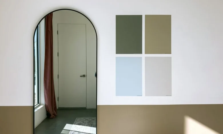
For generations, testing paint colors involved purchasing messy sample pots, painting large swatches directly onto drywall, and watching how natural and artificial light shifted the hue throughout the day. The advent of peel-and-stick paint samples revolutionized this process, allowing consumers to move repositionable, true-to-color swatches across different walls without damaging existing finishes. Because these adhesive samples make testing multiple options easier, cleaner, and more affordable, homeowners are increasingly willing to cast a wider net. They sample across competing brands—frequently testing a Sherwin-Williams neutral against a Farrow & Ball historic shade and a Benjamin Moore contemporary favorite—to find the exact nuance they desire.
By tracking these digital and physical sample orders on a macro scale, market analysts can observe consumer shortlists with granular precision. The resulting data exposes underlying design shifts long before they manifest in retail sales figures or home renovation magazines.
A Historic Shift: The Dominance of Warm Palettes
The most striking revelation of the inaugural Samplize report is the velocity at which warm color palettes are overtaking cool tones in American households. Over the three-year study period, warm colors grew nearly three times faster than cool colors. They now command an overwhelming 69.4 percent of all color samples tested on the platform, climbing steadily from 64.3 percent just two years prior.
Perhaps even more telling is the composition of the modern color shortlist. Half of all American shortlists examined in the report contain zero cool colors—such as stark blues, crisp grays, and icy whites. This represents a notable increase from the beginning of the study, when only 43 percent of shortlists entirely excluded cool hues.
For the past decade and a half, the American interior design landscape was dominated by the cool gray revolution. Sleek, clinical grays and stark, minimalist whites reigned supreme in urban apartments, suburban tract homes, and high-end architectural renovations alike. While this clean, Scandinavian-inspired aesthetic offered a sense of order and modernity, it eventually gave way to widespread consumer fatigue. Homeowners began craving environments that felt more grounded, organic, and emotionally resonant.
The Samplize data proves that this migration away from cool tones is not a temporary whim; it is a structural, nationwide realignment of residential color preferences. The question for interior designers and paint manufacturers, however, was not whether warmth was winning, but how that warmth would manifest across different design applications.
Depth and Drama: The Surprising Rise of Deep Warm Tones
Conventional wisdom in the interior design sector might suggest that a shift toward warmth equates to a retreat into safety—a mass return to pale beige walls, soft ivories, and muted creams designed to fade into the background. However, the granular depth analysis within the Samplize report defies this simplistic assumption.
"The genuine surprise was in the split by depth," notes Makenna Lutz. "We expected the warming to show up as lightening—it didn’t. Warm outgrew cool at every depth, and the deepest warm tones grew fastest of all, roughly six times faster than deep cool tones."
This statistic shatters the myth that warm colors are inherently timid or light. While the data certainly captures the continued popularity of soft, blush-toned plasters and delicate warm creams—such as Farrow & Ball’s historic Setting Plaster, Benjamin Moore’s Proposal, and Sherwin-Williams’ Malted Milk—it simultaneously highlights an explosive appetite for intense, highly saturated warmth.
At the opposite end of the spectrum, deep, dramatic hues are experiencing a renaissance, provided they possess a warm undertone. Benjamin Moore’s Classic Burgundy, easily one of the darkest and most dramatic colors included in the study, grew at a pace comparable to the lightest warm pastels. This indicates that contemporary homeowners have not lost their desire for moody, immersive, and high-impact interiors. Instead, the emotional temperature of that drama has shifted. The cold, austere navy blues and charcoal grays that defined the dramatic accent walls of the late 2010s are increasingly being replaced by rich, enveloping burgundies, bruised plums, and spiced earth tones that radiate heat and intimacy.
The Brown Renaissance: Redefining Neutrals
No color family exemplifies this shift toward nuanced warmth quite like brown. According to the Samplize report, brown shades grew faster than any other color category over the tracking period, now appearing in 13.4 percent of all consumer shortlists compared to just 9.2 percent previously.
However, a closer inspection of the specific shades driving this growth reveals that the modern brown revival bears little resemblance to the heavy, reddish-brown chocolate tones that dominated interior design during the Tuscan-inspired aesthetic of the early 2000s. Today’s consumers are not looking to recreate rustic mountain lodges or heavy traditional spaces.
Instead, the surge in brown shortlists is being propelled by complex, highly mutable neutrals. Shades like Sherwin-Williams’ Warm Stone and Urbane Bronze, Farrow & Ball’s London Clay, and Benjamin Moore’s Smokey Taupe are leading the charge. These colors occupy a sophisticated middle ground between gray and brown—commonly referred to in design circles as "greige" or stone-like neutrals. They offer the anchoring weight of a dark brown combined with the modern, versatile subtlety of a warm gray, making them the ultimate transitional backdrop for contemporary furniture, natural wood finishes, and textured fabrics like boucle, linen, and raw jute.
Botanical Stability: Green Holds Its Ground
While warm neutrals and deep red-browns are capturing the momentum of growth, green has successfully solidified its position as a permanent fixture in the American interior palette.
Following a meteoric rise during the peak of the pandemic home-renovation boom—driven by an innate human desire to bring the restorative qualities of the outdoors inside—green has avoided the typical post-trend slump. Rather than fading away as quickly as it arrived, green has stabilized at a high level of consumer interest, appearing in 34.6 percent of all shortlists analyzed in the report.
Crucially, the green samples being tested span a remarkably broad spectrum. Homeowners are not fixating on a single shade of emerald or sage; rather, they are exploring everything from pale, silvery eucalyptus greens to deep, moody botanical shades like forest and hunter green. This versatility suggests that green is no longer viewed as a trendy accent color, but rather as a foundational neutral of the natural world—a color versatile enough to function like a soothing background neutral in bedrooms, kitchens, and living areas alike.
Behavioral Insights: The All-Warm Household
Beyond specific color families and depth measurements, the Samplize report offers a fascinating glimpse into the psychological rigidity—or decisiveness—of modern renovators. The data reveals that temperature consistency is a major guiding principle in contemporary design decision-making.
Two-thirds of all color shortlists analyzed in the study contain colors drawn from only one temperature group. Breaking that down further, fully half of all shortlists are entirely warm, while only about a third of consumers mix warm and cool shades during their sampling phase.
This high degree of temperature segregation suggests that homeowners are approaching color selection with a strong overarching vision. Rather than hedging their bets by mixing contrasting temperatures across different rooms or trying to bridge cool architectural elements with warm furniture, many consumers are committing fully to a unified thermal environment. Whether they are aiming to create a sun-drenched, cocooning sanctuary of warm creams and terracottas or a crisp, airy haven, they tend to keep their experimental shortlists strictly within aesthetic boundaries.
Furthermore, signs indicate that this warming palette is becoming increasingly vibrant. While neutrals still anchor the bulk of sampling activity, pink and red represent the fastest-growing color families from smaller starting points. When combined with the data showing that warm-and-deep is the fastest-growing combination of temperature and depth, it becomes clear that American homeowners are becoming bolder, more expressive, and more willing to experiment with emotional color registers.
Broader Implications for the Design and Paint Industries
The release of the inaugural Samplize American Paint Color Report carries significant implications for interior designers, paint manufacturers, and home-improvement retailers alike. For years, the paint industry relied heavily on historical sales data and expert panels to forecast the future of color. While those methods have undeniable value, they inherently suffer from a lag effect, reflecting what consumers bought yesterday rather than what they are contemplating today.
By capturing the exploratory phase of home design—the moment when a consumer is actively debating between a moody burgundy, a stony taupe, or a delicate plaster pink—this data provides a forward-looking indicator of aesthetic shifts.
For paint manufacturers, the data underscores the necessity of expanding and refining the warm spectrum. It suggests that R&D departments should focus less on developing cooler, crisper architectural whites and grays, and instead invest in complex, multi-undertone neutrals, deeply saturated warm accents, and sophisticated earthy tones that satisfy the modern consumer’s craving for comfort and character.
For interior designers, the report validates a design philosophy that has been gaining traction in high-end residential projects: the shift away from stark minimalism toward tactile, enveloping spaces designed to promote psychological well-being. As homes increasingly serve as multi-functional sanctuaries—acting simultaneously as offices, gyms, and places of rest—the desire for spaces that feel emotionally nurturing, warm, and grounded has never been stronger.
Looking Ahead: What Comes Next for American Walls?
It is important to contextualize what three years of sample data can and cannot predict. The surge in warm samples, the dominance of complex greiges, and the rapid growth of deep burgundies do not mean that classic burgundy is about to become the new ubiquitous neutral, nor does it guarantee that cool grays will never make a cyclical return.
Design trends are fluid, cyclical, and deeply tied to broader cultural, economic, and technological shifts. The pandemic-era cocooning trend accelerated a need for comfort, which naturally translated into warming color palettes. As society continues to evolve, consumer preferences will undoubtedly shift in response.
Nevertheless, the data from the first Samplize American Paint Color Report paints a vivid portrait of a nation actively redefining its domestic spaces. From soft plaster pinks that catch the morning light to weathered stone browns and immersive, dramatic reds, American homeowners are looking beyond the safe confines of cool minimalism. They are exploring warmth across the entire spectrum—proving that when it comes to the walls we live within, the desire for comfort, depth, and emotional resonance is charting a bold new course for the future of interior design.